The first website was launched over 30 years ago, in 1991.
A lot has changed on the world wide web in the past three decades. We now know that business success is linked to effective website design. Making website design mistakes can make or break your business.
The good news is, these mistakes are avoidable. With the right know-how and the right website design team, these mistakes won’t affect your website and business.
Keep reading to find out everything you need to know about website design mistakes and how to avoid them.
1. Not Optimizing for Different Devices
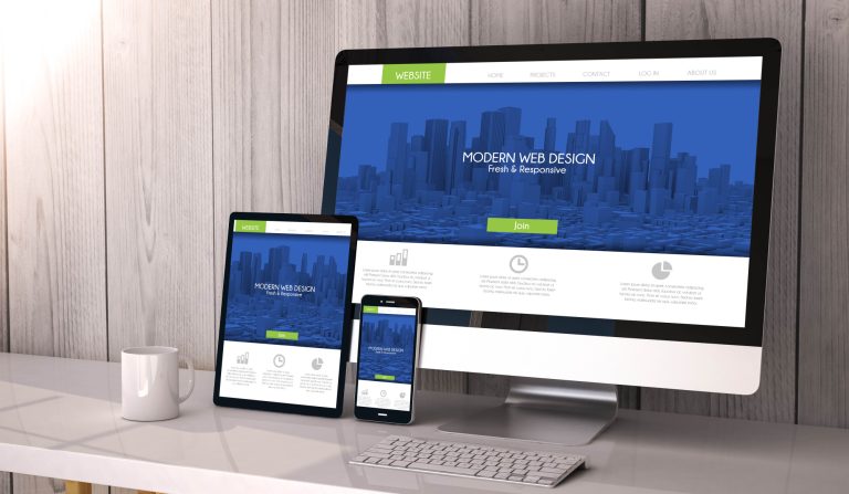
One mistake to avoid when designing business websites is not to make your website accessible from different types of devices.
Your website design should be functional and aesthetically pleasing from a desktop computer or iPad, and most importantly, it must be mobile-friendly. More consumers are using their smartphones to browse and shop than by using desktops or other devices.
2. Confusing Navigation
One of the things that will cause a potential client to turn away from your website is confusing navigation. Website design should prioritize user-friendliness. Think of website navigation as a simplified map that takes the user to where they need to go.
Some things that can help your website navigation are:
- A well-placed navigation bar
- Avoiding too many drop-down menus
- Using specific labels
- Avoiding too many options
- Responsive website navigation
3. Weak Calls-to-action (CTAs)
A call to action is designed to prompt a potential client to take a desired action.
You should use web design tools to add content, describe your product or service, and include a compelling phrase to prompt action on their part. Some examples of calls-to-action include:
- Get Started
- Add to Cart
- Buy now
- Sign me up
- Contact us today
4. Too Many Design Elements
Your website should be clear and concise. It should be appealing to the eye and should not be drowning in design elements.
Too many design elements on any given page will drain consumer interest and have them. Avoid excessive text, distracting backgrounds, too many product listings, and too much media content.
An increase from 400 to 6,000 elements per page, including titles, texts, and images, and the chances of conversion drop by 95%.
5. Too Long to Load
Slow load times mean one thing—the loss of website visitors. Everyone wants fast access to information.
Too many plugins, photos, themes, and videos increase load time. Slow load times also significantly affect your search engine rankings. Ensuring a fast website loading speed is an important element of successful web design.
6. Hidden Contact Information
Clients want to reach you, but you have to give them the tools to do so. Make sure your phone number, email address, and location are easy to find with a clear call to action. You should also include a dedicated contact page.
Say No to Website Design Mistakes
Now that you know which website design mistakes to avoid, you can build a new website or improve on your existing one. The best way to avoid aesthetic and functional website mistakes, consult with a professional website designer.
At Enfuse Creative Design, we can assist you with any of your web development projects. No matter your web design budget, we can help you grow your business with website development and design, graphic design, and print media. Contact us today to get your web project started!
