There are over 1.5 billion websites on the internet right now, and more adding to that every second.
Depending on your industry, you could be looking at some stiff online competition.
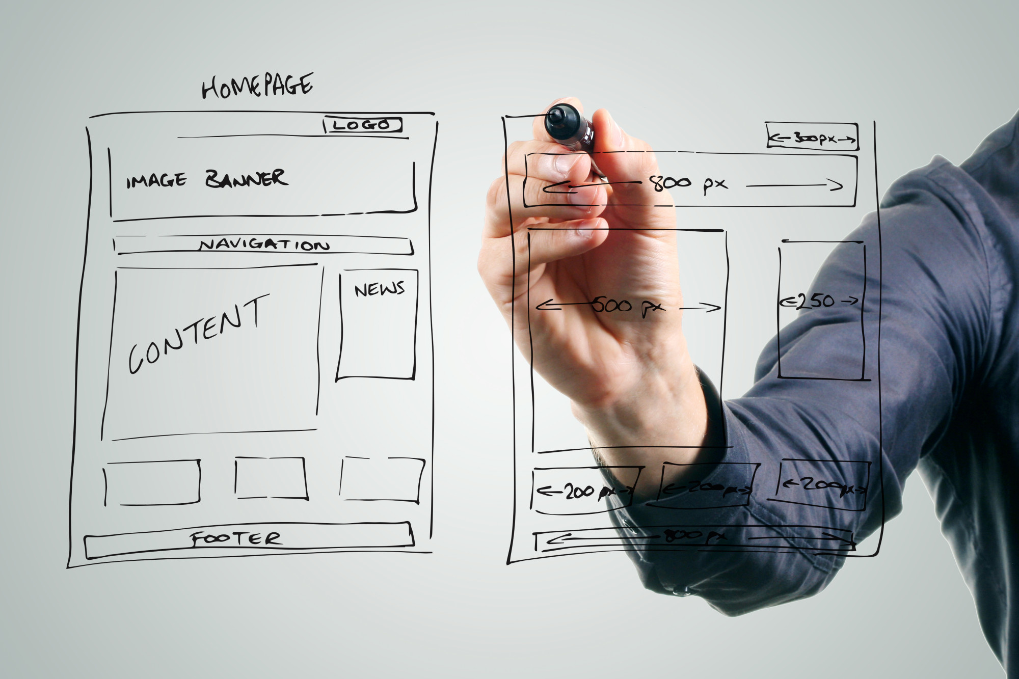
So, it goes without saying (but we’ll say it anyway), your website needs to be sleek, navigable, and user-friendly. It not only needs to invite readers in, but it needs to keep them interested and engaged.
A few crucial web design elements can help you achieve this and get a leg up on your competitors. If you’re not engaging your clients, you’re losing business. And an astounding 94 percent of people will leave a website with bad design.
Here are some key elements to focus on during the creation stages!
1. Have Unique Typography
The font you use on your page sends a message to your readers.
Specific fonts are whimsical and fun — ideal for a baker’s website, but not a law office’s. Some fonts are strong and bold. Others convey authority and expertise.
Take The New Yorker’s Adobe Caslon font. The crisp edges of their letters are synonymous with this prestigious magazine.
Choose a font that will be just as identifiable for your brand.
2. Use the Hamburger Menu
Just as a hamburger is stacked, layer by layer, so too should your menu be.
Keep the deconstructed hamburger layout in the past. Instead, your toolbar that helps users navigate should be in the corner of your page. When users click that menu, it should be a drop-down that clearly displays each section.
More straightforward navigation is enough to keep people on your page.
3. Generate a Color Palette
If your website starts with a large image (another excellent web design trend), you can actually generate a color palette that matches its tones.
Creating consistency across the page looks sleek, polished, and professional. Graphic design lovers will appreciate that everything matches, color- and otherwise.
You can find color palette generators online for free!
4. Keep It Minimal (Embrace White Space)
Less is more — this rule particularly applies to modern websites.
The less that’s distracting your reader, the easier they can get to what they came for.
The toothbrush brand Quip has a wonderful example of this on their homepage.
Their product and mission are clearly visible on the page, but it’s surrounded by white space. This draws all the attention to their product. (They also make fantastic use of their color palette!)
5. Use Card Design
The card design is beginning to appear on more and more websites.
This is especially great if your page has a ton of content.
Using this web design element, you can essentially create thumbnails with images and brief headers or excerpts. Readers will find what intrigues them and click it, without having to scroll through countless pages perusing text.
As an example, think about Pinterest. They utilize a card design for their page. And we all know how popular Pinterest is!
These Web Design Elements Will Improve Your Internet Game
The key is to not focus on one of these elements, but all of them in tandem.
Considering each of these web design elements and using them together increases your power online. If you can engage users with fantastic font, an easy-to-navigate page, and a generally ad-free space, they’ll become customers for life!
We can help with that. Contact us today to see how we can get business owners like you to strengthen their brand.
